
Living rooms carry a particular weight within the home. They are used frequently, viewed from multiple angles, and tend to be the most socially exposed spaces.
Wall art placed here is not glanced at occasionally; it becomes part of the room’s visual structure. For that reason, choosing living room wall art benefits from the same level of consideration given to furniture, lighting, and materials.
Photography plays a distinctive role in this context. Unlike illustration or graphic work, photographic wall art brings a sense of specificity – a real place, a moment in time, a physical subject captured through a lens.
That specificity can either support a room’s atmosphere or work against it, depending on scale, surface, and how the image interacts with its surroundings.
This article looks at living room wall art from a photographic and material perspective, focusing on decision-making rather than taste.
Scale and Viewing Distance Matter More Than Subject
In living rooms, wall art is often viewed from several metres away, not from arm’s length. This affects how a photographic image reads. Fine detail that looks engaging on a screen can disappear at distance, while broader tonal structure becomes more important.
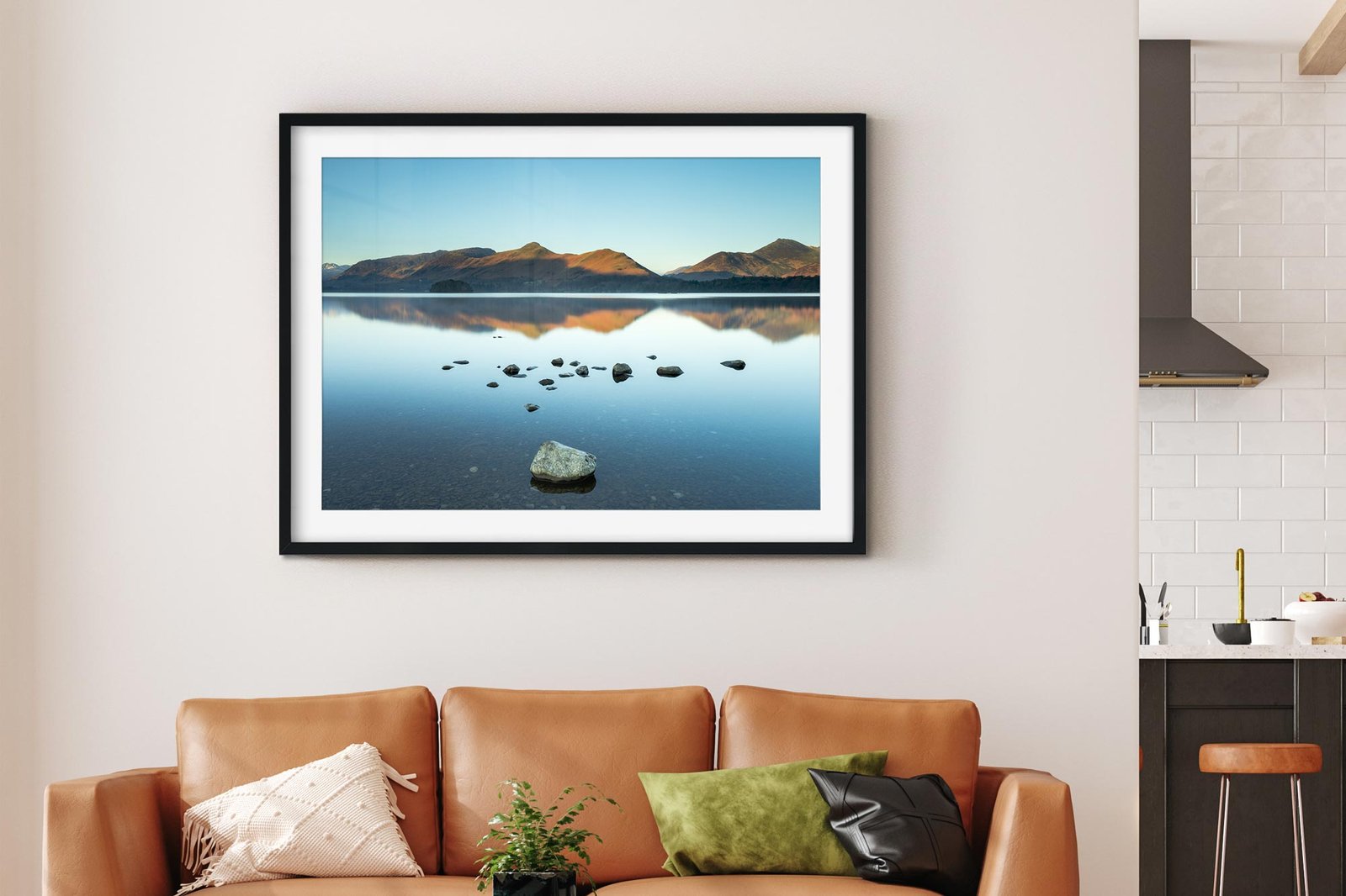
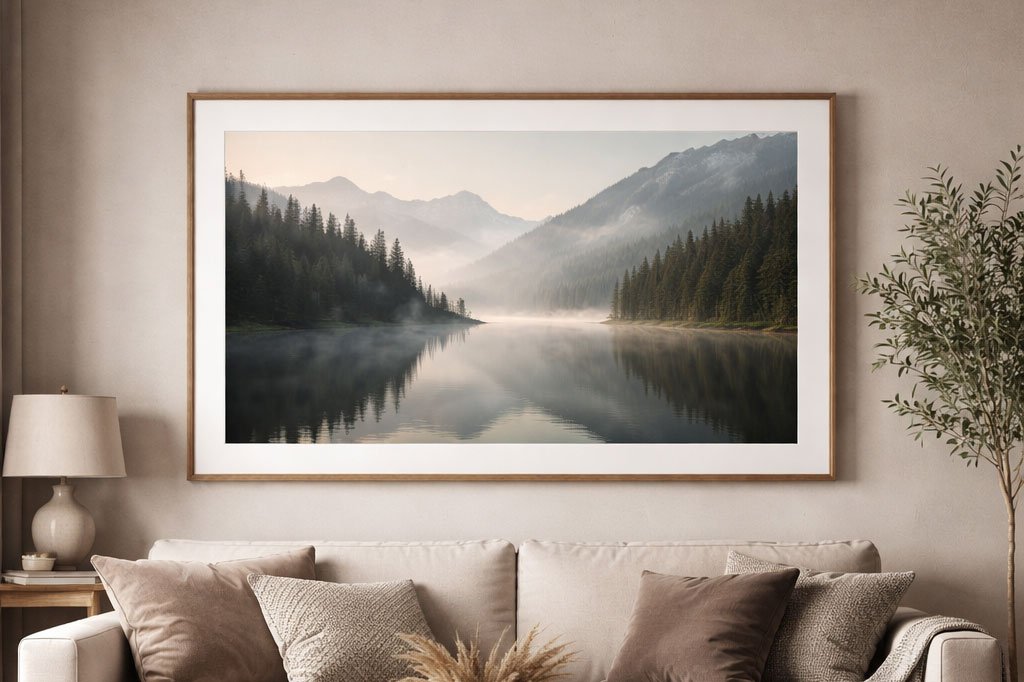
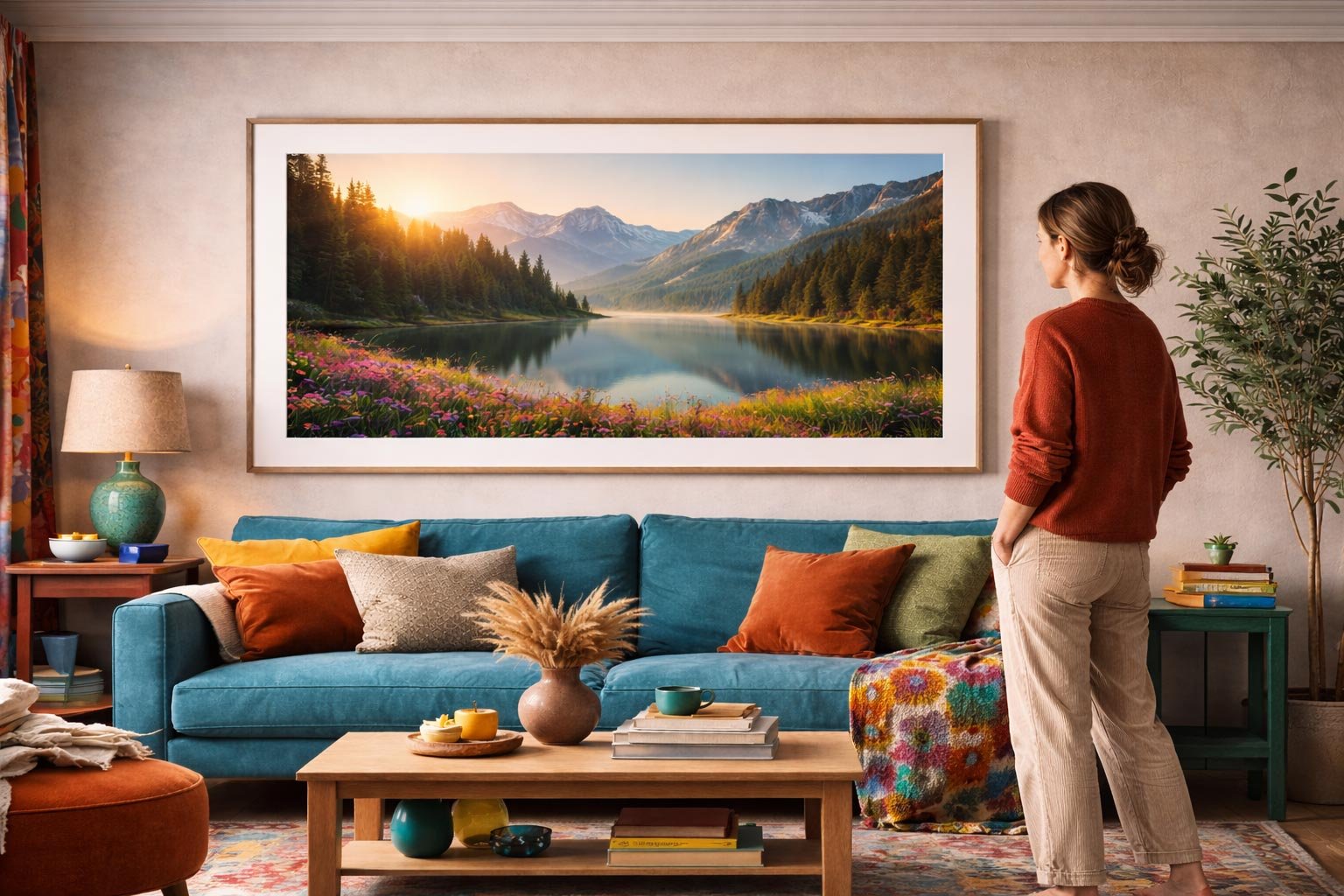
Larger photographic prints tend to work well in living rooms not because they are “statement pieces”, but because they remain legible across the space. A landscape with strong horizon lines, a minimalist coastal scene, or a carefully composed architectural photograph will often read more clearly than a densely detailed image when viewed from across the room.
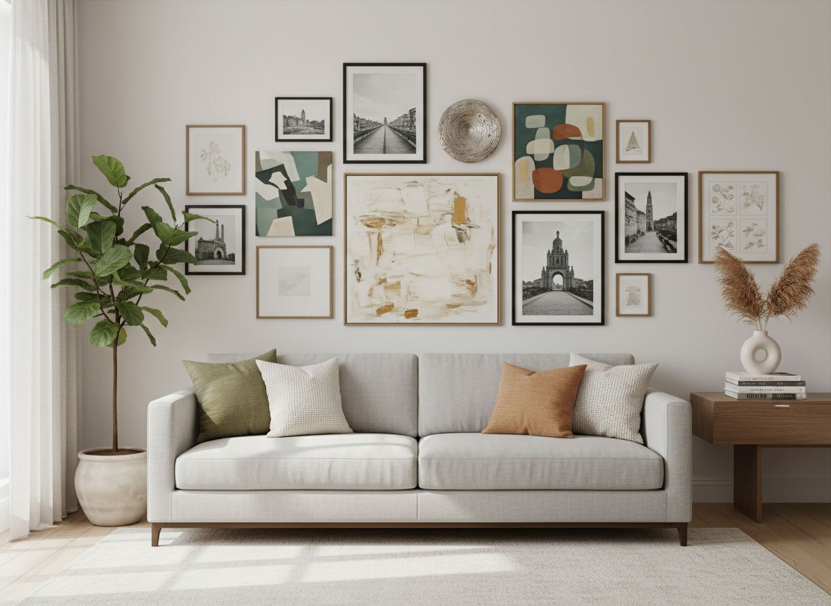
When working with smaller walls or grouped arrangements, consistency of scale and spacing matters more than individual images. A series of related photographs, evenly spaced, can function as a single visual element rather than competing points of attention.
Colour, Tone and The Surrounding Interior
Living room wall art does not exist in isolation. Upholstery, flooring, wall colour and natural light all affect how a photograph appears once installed.
Photographic work with restrained colour palettes or strong tonal control often integrates more easily into living spaces. Black and white photography, for example, removes colour clashes from the equation and allows texture and contrast to take precedence.
Muted colour landscapes can achieve a similar effect, especially in rooms where furnishings already introduce variation.
Lighting conditions should also be considered. A photograph that relies on subtle shadow detail may struggle in a dimly lit living room, while high-contrast images can feel visually heavy in smaller or darker spaces.
Print Surface as A Design Decision
The choice of print finish has a direct impact on how photographic wall art behaves in a living room environment.
Framed posters with mounts introduce visual structure and tend to suit more traditional or layered interiors. The mount acts as a pause between image and wall, giving the photograph space to breathe.
Canvas prints remove reflective surfaces and can work well in rooms with strong natural light or where glare is an issue. They often soften the image slightly, which can be appropriate for relaxed, informal spaces.
Acrylic-mounted photographic prints offer a very different presence. The surface depth and light interaction can enhance colour and contrast, making them suitable for contemporary interiors where cleaner lines and reflective materials are already present.
However, they demand careful placement, as reflections become part of the viewing experience. The key point is that print finish is not a technical afterthought; it is part of the visual language of the room.
Placement and Visual Balance
Where living room wall art is hung often matters as much as what is chosen. Over sofas, sideboards, or fireplaces, alignment should relate to furniture rather than ceiling height. Hanging too high is one of the most common issues in domestic interiors.
Negative space is also important. A single, well-scaled photograph on a clear wall often works better than multiple images competing for attention. In rooms with architectural features or strong textures, quieter photographic compositions can provide balance rather than visual noise.
Living room wall art works best when approached as part of the room’s structure rather than its decoration. Photography, with its inherent link to real places and moments, offers clarity and restraint when chosen carefully.
Considering scale, surface, provenance and placement leads to decisions that feel settled rather than styled – and that is often what allows a living space to hold together over time.
I may be biased (being a photographer myself) but I totally agree that photographic artwork is ideal for front rooms. Of course other forms of art may suit other people more but it’s just a good feeling when you have a real landscape photo on your wall.
It’s great to hear a photographer’s perspective on this! I completely agree about that distinct ‘feeling’ you mentioned. As I touched on in the post, photography brings a unique sense of specificity-a real place or moment-that anchors a living room in a way other art forms sometimes don’t. Landscapes are a perfect example of that, especially since they often have the strong horizon lines and scale needed to read clearly across a larger space like a front room. Thanks for reading!