
The space behind a sofa often sits empty for too long. This large blank area can make an entire living room feel unfinished or unbalanced.
It acts as a focal point that naturally draws the eye when you enter the room. Leaving it bare is a missed opportunity to add character to your home.
Finding the right item to fill this gap is sometimes difficult. You might worry about hanging artwork too high or choosing a piece that clashes with the couch.
The scale needs to be correct so the furniture does not dwarf the décor. These concerns often cause homeowners to hesitate and do nothing.
There are many practical ways to style this specific wall without overthinking it. We have compiled a list of suggestions ranging from gallery walls to simple DIY shelving.
These options cover various budgets and design preferences. Here are 19 ideas to help you decorate the wall above your couch.
1. Curated Gold Frame Gallery
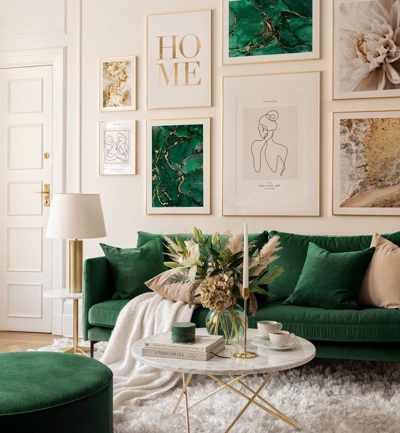
Gold thin frames create a structured layout while remaining light. Abstract green prints balance the minimal line art perfectly.
Typography adds a personal touch to the visual collection without clutter. Vertical alignment helps the ceiling feel slightly higher in small rooms.
Mixing textures on the wall keeps the view engaging.
2. Eclectic Wood & Art Mix
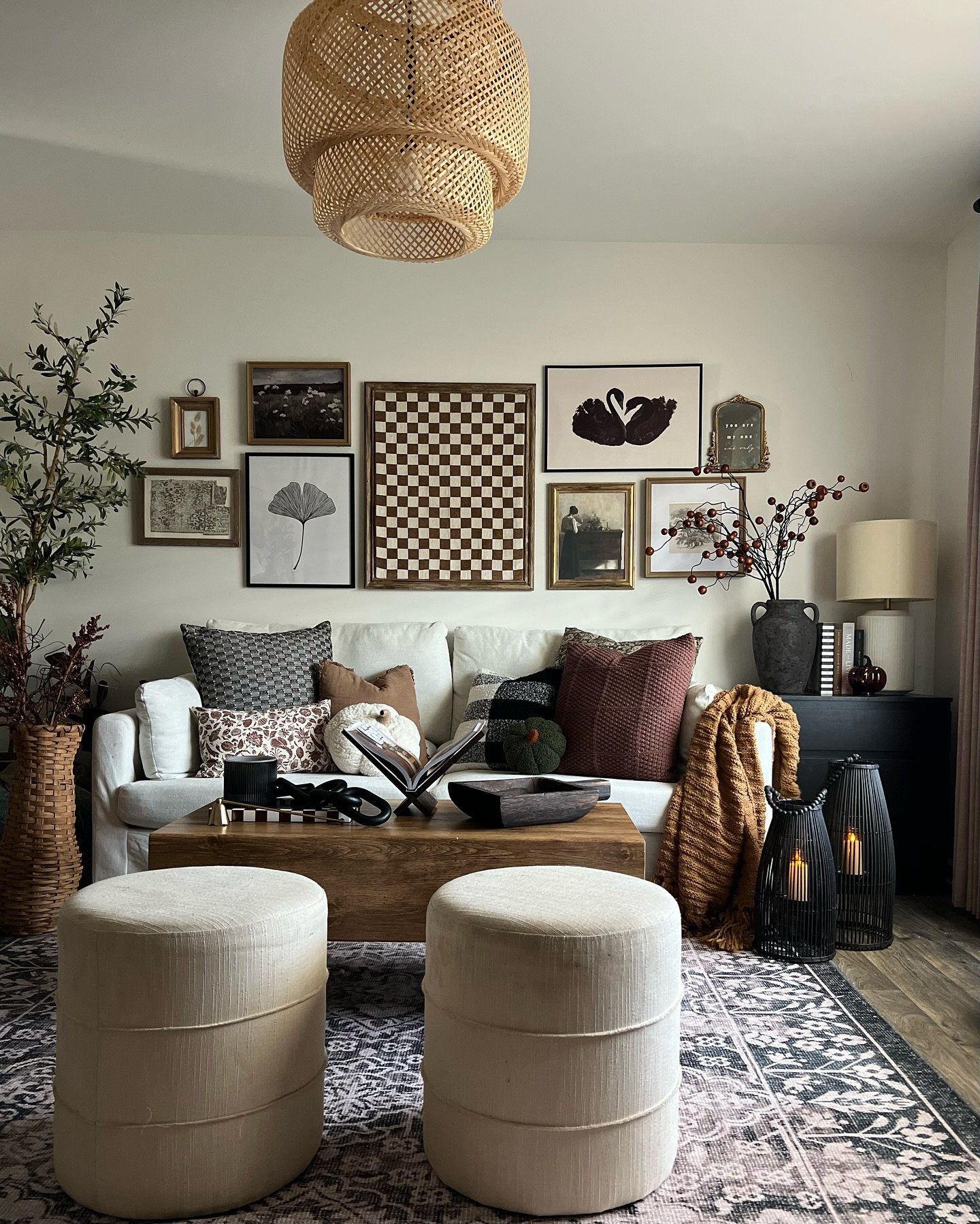
A wooden checkerboard piece anchors the display to add geometric interest. Surrounding black and gold frames create a cohesive yet varied look.
Vintage prints mix with modern silhouettes for a timeless appeal. Warm wood tones in the frames connect with the room’s natural elements.
This layout proves that mismatched items can form a unified gallery.
3. Oversized Mat Trio
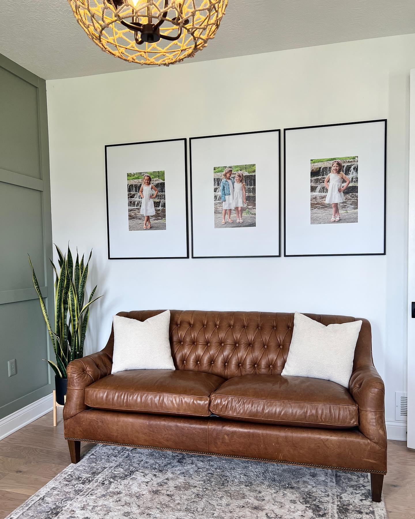
Large white mats create a clean focal point instantly. Thin black frames provide sharp definition against the white paint.
Symmetrical arrangement balances the visual weight of the leather sofa. Personal photos turn the plain wall into a cherished memory lane.
Keeping the frames identical creates a sense of calm order.
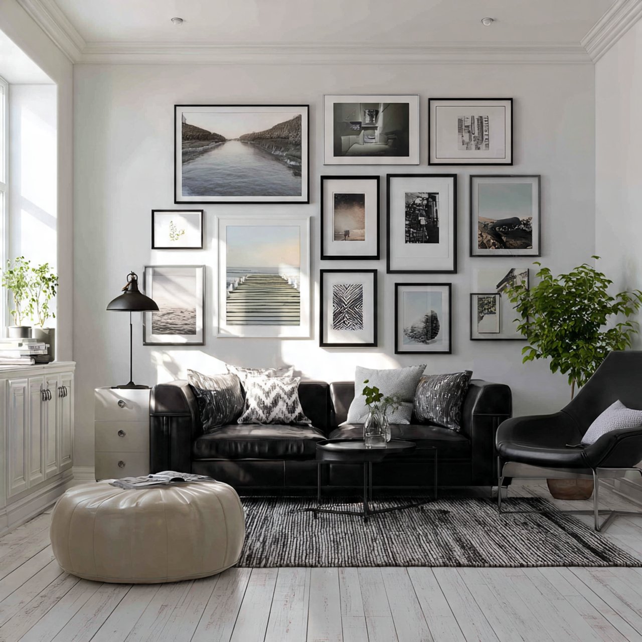
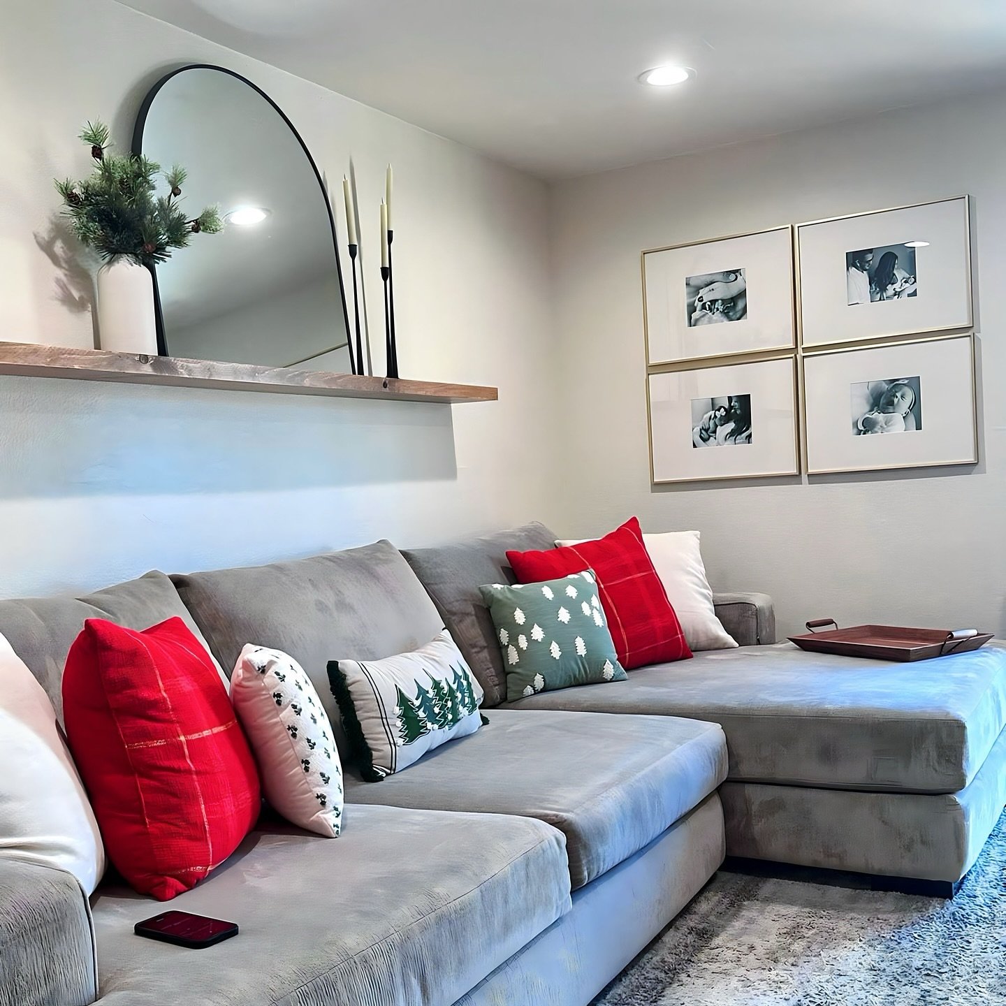
4. Structured Grid Gallery
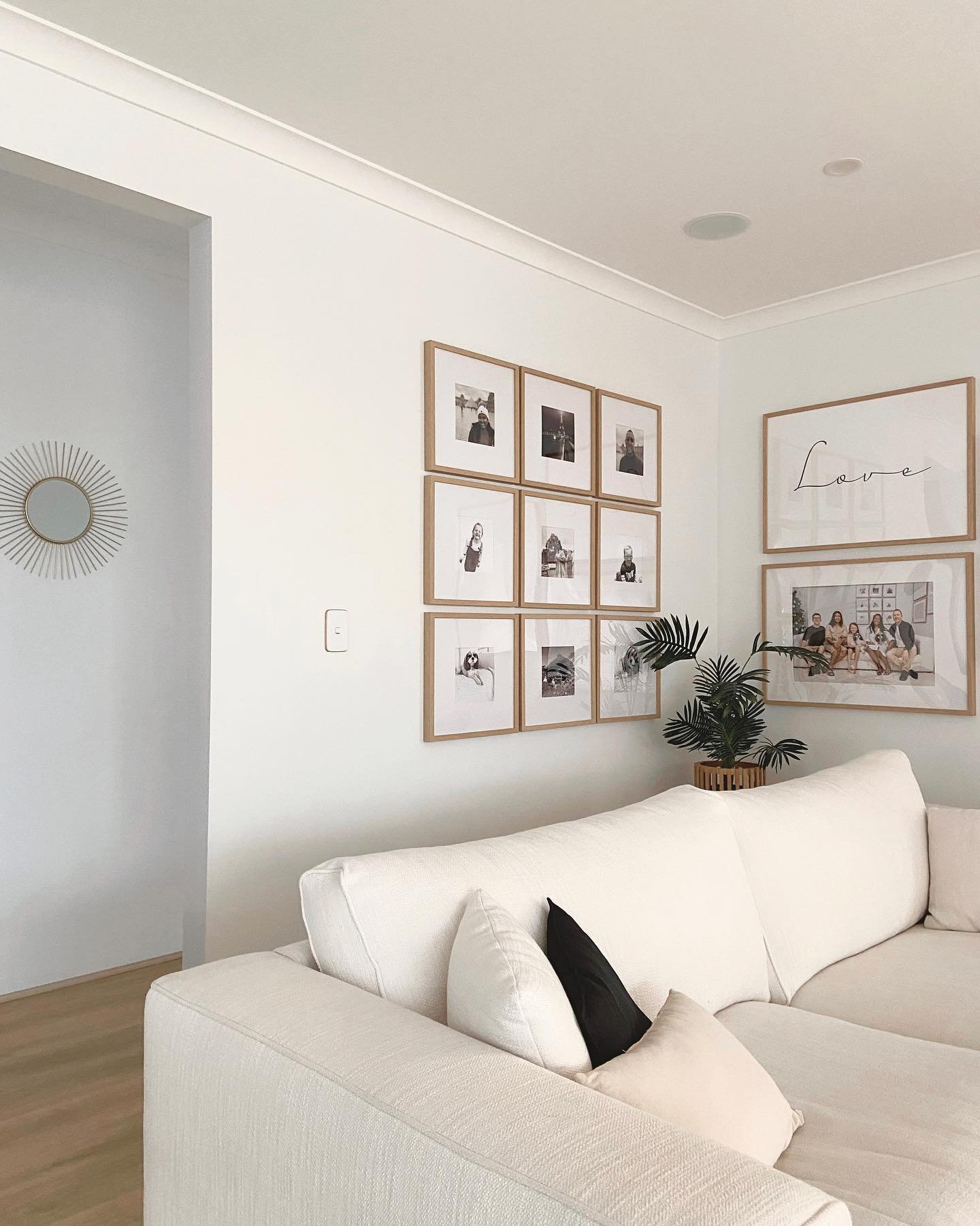
A uniform grid of square frames brings instant organization to the large wall. Light wood tones soften the look against the bright white paint.
Black and white photography maintains a timeless aesthetic that survives changing trends. Wide white mats ensure the small images capture full attention.
Splitting the layout between a grid and stacked statement pieces adds visual rhythm.
5. Dark Contrast Art Display
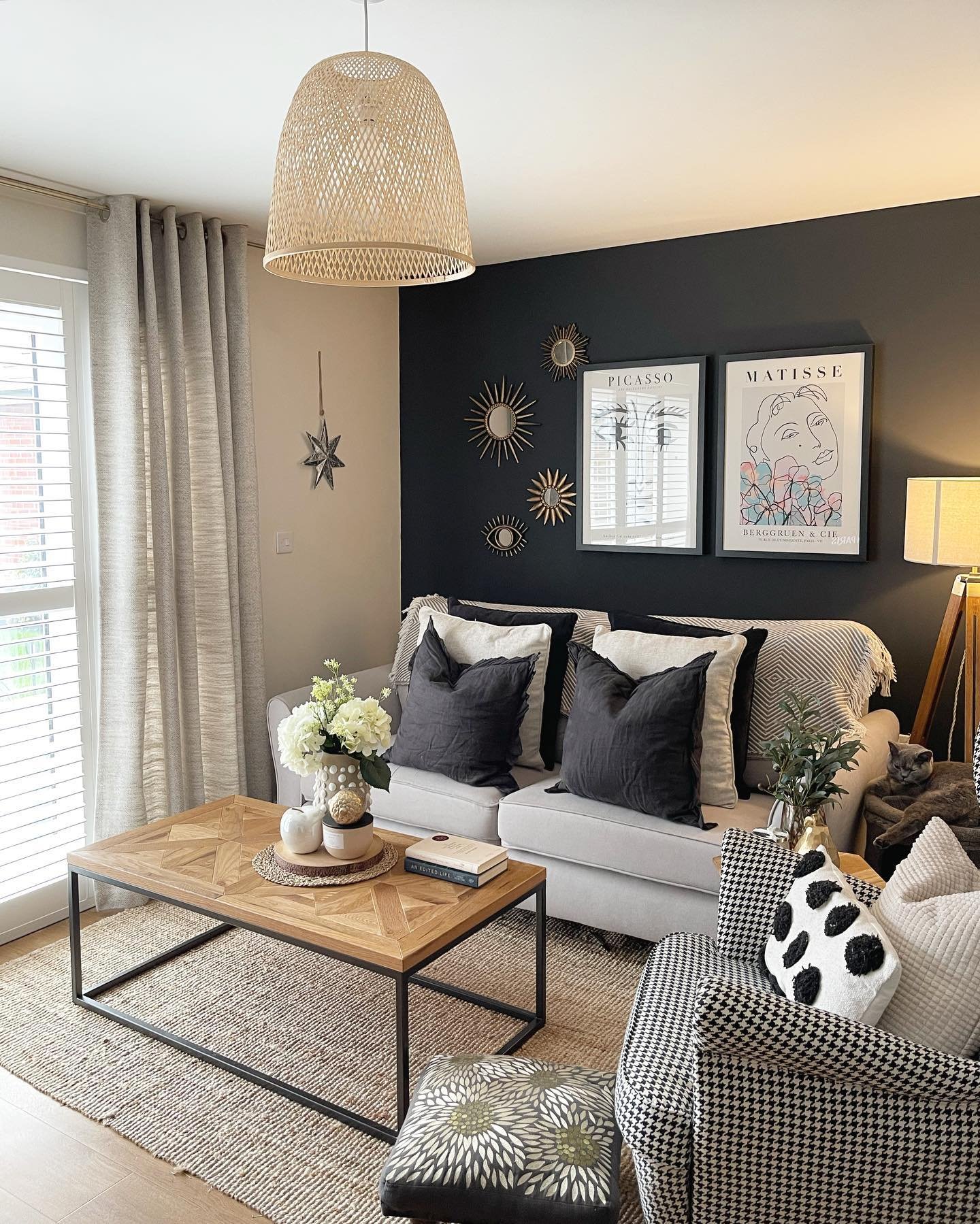
A deep charcoal wall creates instant visual drama behind the seating area. Large white-matted prints provide sharp high contrast against the dark paint.
Small gold sunburst mirrors introduce metallic texture to break up the solid color. Grouping different shapes creates an eclectic balance that feels curated.
This bold backdrop makes every light element stand out clearly.
6. Modern Monochrome Mosaic
Black and white photography creates a sophisticated mood that feels deliberate. Thin black frames tie the varied sizes together for a cohesive look.
Landscape prints introduce a calming perspective to the modern setting. Using a puzzle-style layout utilizes vertical space to make the ceiling appear higher.
This arrangement proves that grayscale art creates a powerful impact.
7. Sloped Ceiling Gallery Fit

The layout cleverly follows the slanted ceiling to maximize every inch of vertical space. Mixing frame styles creates a collected aesthetic that feels organic rather than rigid.
Small colorful pieces fill the awkward gaps often found in loft rooms seamlessly. Earthy tones in the art echo the textured rug below for visual harmony.
This approach turns architectural challenges into a unique feature wall.
8. Large Scale Wildlife Trio
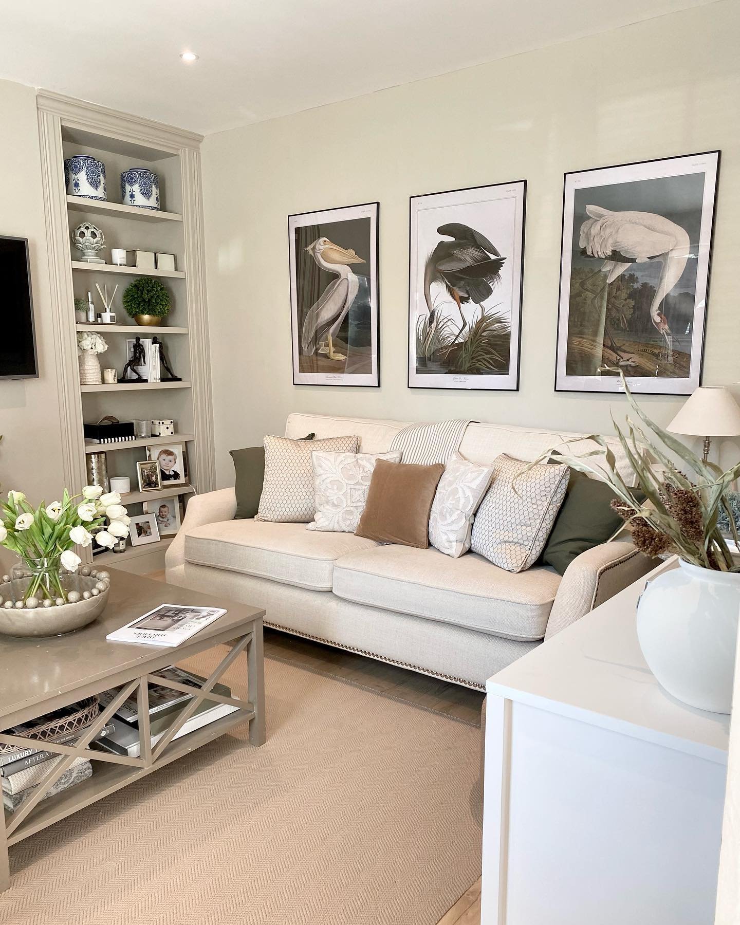
Large scale bird illustrations bring the outdoors inside gracefully. Symmetrical placement creates a calming rhythm across the wall.
Muted colors in the art blend with the neutral palette softly. Black frames add necessary definition to the light background.
This triptych acts as a sophisticated conversation starter for guests.
9. Rustic Farmhouse Mirror Display
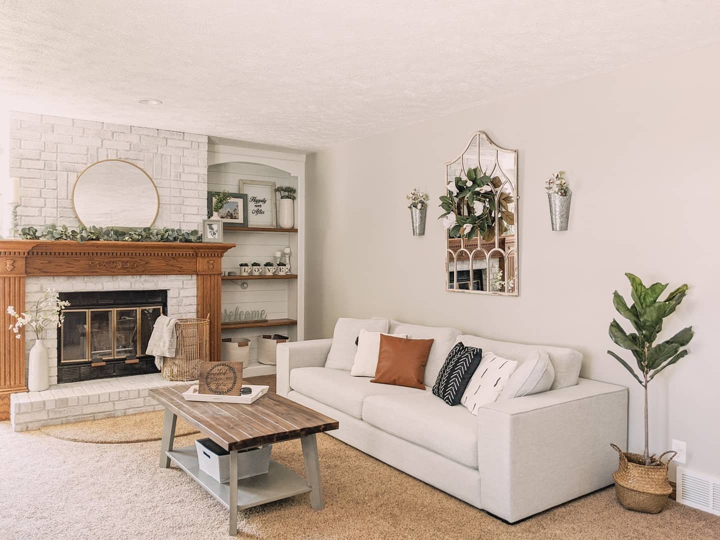
A distressed arched mirror anchors the wall with rustic charm. The window-pane design tricks the eye to expand the visual space.
Adding a leafy wreath introduces soft natural texture to the glass. Flanking galvanized sconces create perfect symmetry on the blank canvas.
This farmhouse setup balances metal and greenery effortlessly.
10. Personal Mixed Media Gallery
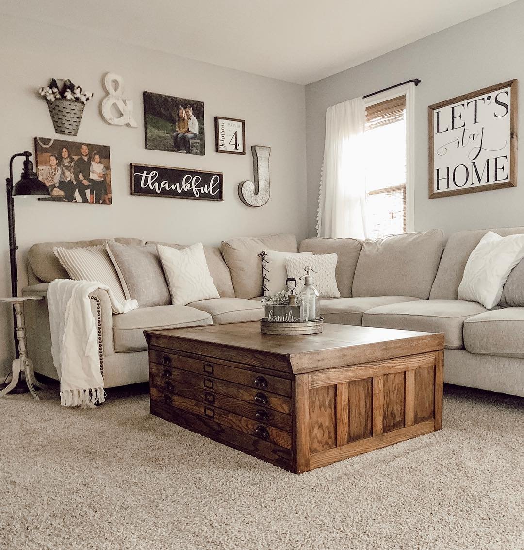
Mixing family photos with wooden signs creates a warm and inviting atmosphere. Large metal letters add industrial texture to the collection.
Distressed wood frames coordinate beautifully with the coffee table below. Placing the art across the corner makes the seating area feel enveloping and cozy.
This eclectic arrangement tells a unique personal story.
11. Oversized Minimalist Statement
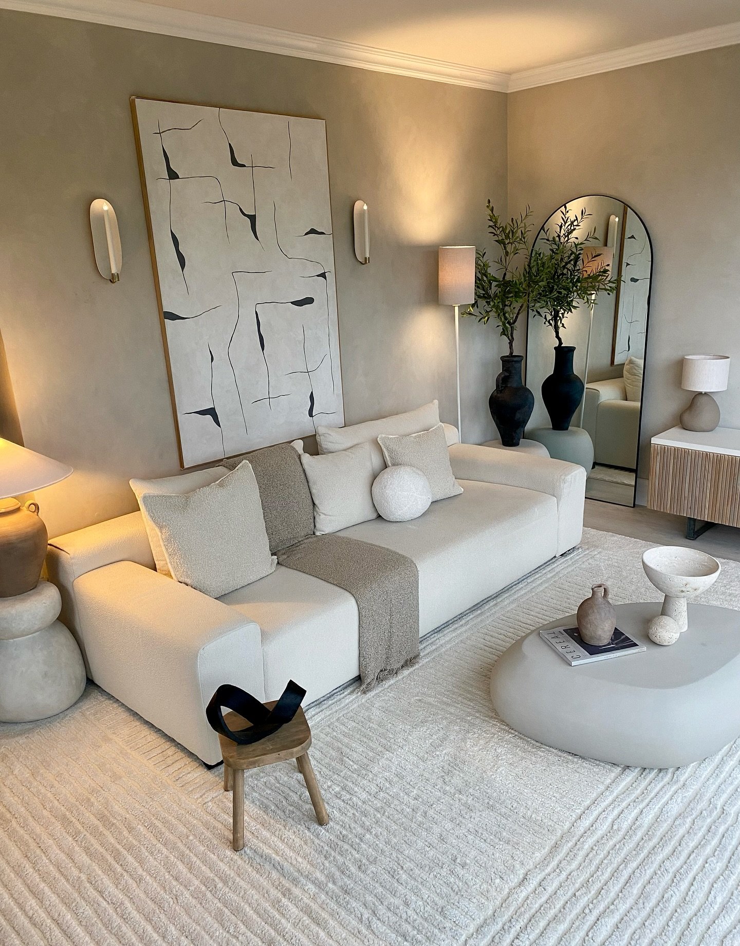
A single oversized canvas anchors the living space with quiet drama. Flanking the artwork with brass sconces establishes immediate balance and symmetry.
The vertical orientation draws the eye upward to celebrate ceiling height. Textured lime-wash walls provide a soft, organic backdrop for the modern lines.
This setup proves that one bold piece creates a serene focal point.
12. Maximalist Color Explosion
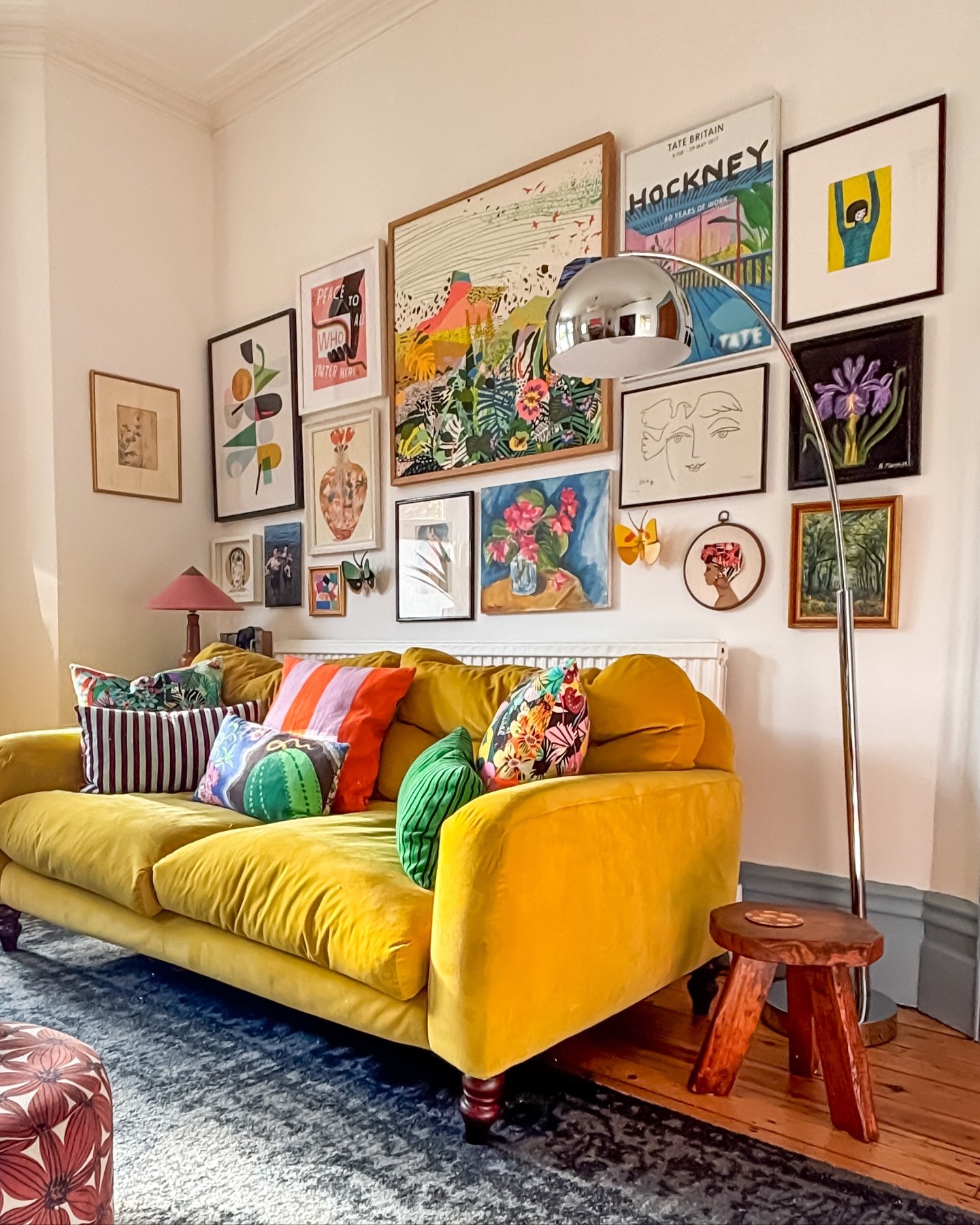
Bold colors collide in this maximalist gallery wall for an energetic atmosphere. Mixing graphic posters with oil paintings creates rich visual depth.
The art extends almost to the ceiling, making the room feel larger and taller. Small decorative objects like butterflies add whimsical 3D texture to the flat frames.
This joyful arrangement perfectly complements the mustard yellow sofa.
13. Layered Ledge Display
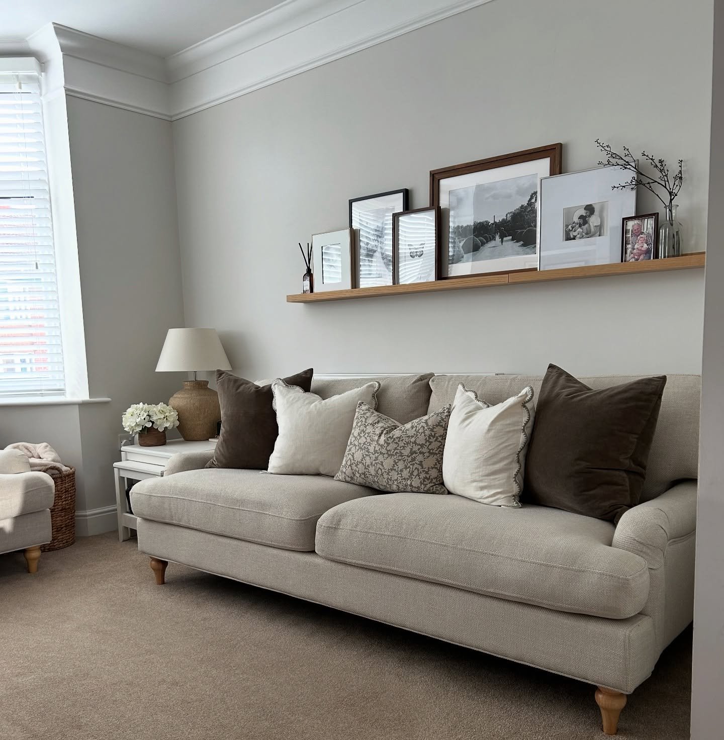
A single wooden picture ledge offers flexible display options without multiple nail holes. Layering frames of different sizes creates a casual, lived-in aesthetic.
Black and white photography keeps the collection visually cohesive despite the varying frame styles. Adding small vases or reeds softens the linear structure of the shelf.
This ledge design allows for easy seasonal updates whenever mood strikes.
14. Paneled Symmetry with Art
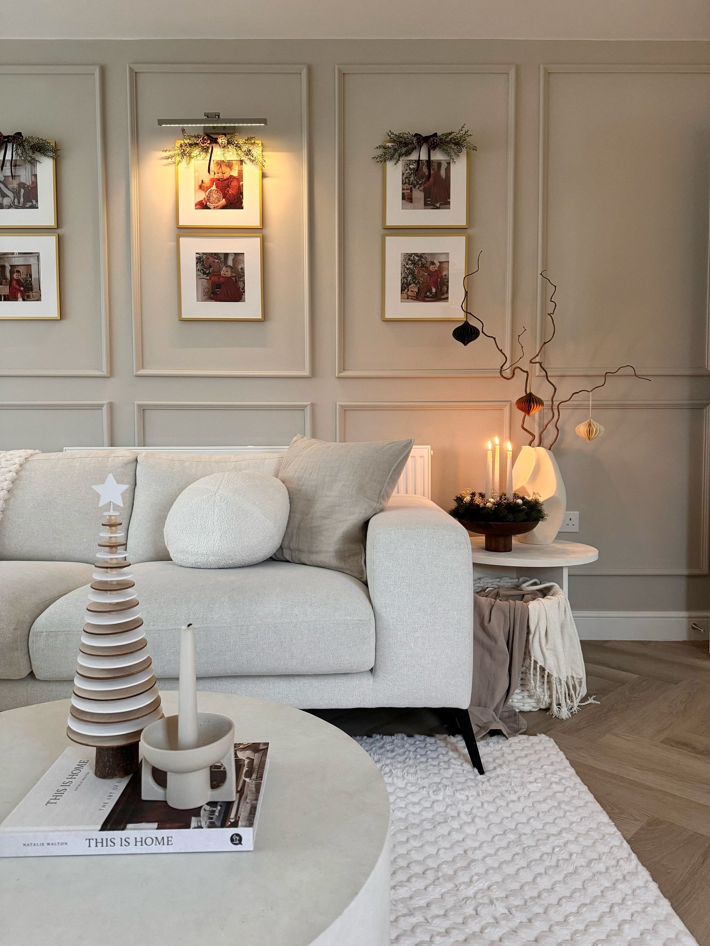
Architectural wall molding creates natural frames for artwork placement. Stacking gold frames vertically within the panels emphasizes the ceiling height effectively.
Picture lights add a gallery-like ambiance and warmth to the display. Seasonal greenery on the frames brings a festive touch without overwhelming the space.
This structured layout blends classic architecture with personal memories seamlessly.
15. Woven Basket Wall Art
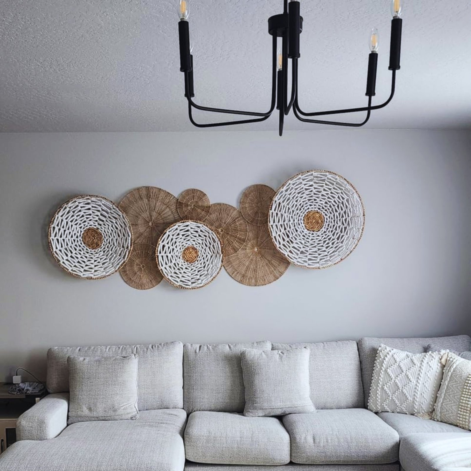
Woven baskets add soft organic texture to the blank space. Overlapping different sizes creates a dynamic 3D visual effect.
Natural tones blend with white weaves for a calming neutral palette. Circular shapes soften the straight lines of the modern sofa.
This arrangement brings a relaxed boho vibe instantly.
16. Travel & Typography Eclectic Mix
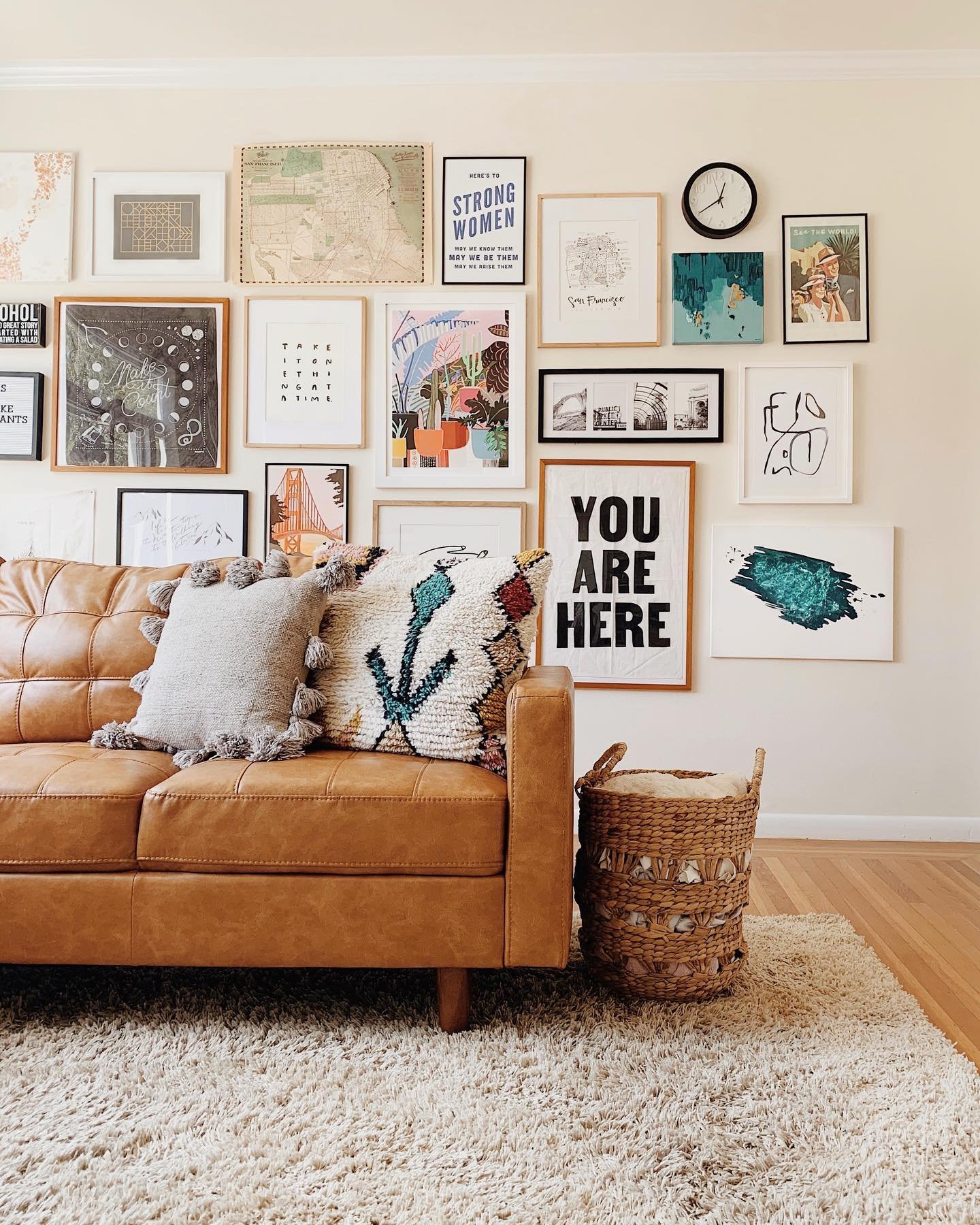
Maps and typography prints combine to create a wanderlust theme across the wall. Bold statements like “You Are Here” add a modern graphic punch to the collection.
Mixing light wood and black frames creates a casual balance that feels effortless. The warm leather sofa anchors the busy wall with rich earth tones.
This floor-to-ceiling arrangement turns a plain room into a visual diary.
17. Asymmetrical Shelf & Grid
A floating wooden shelf introduces a linear focal point for versatile styling. Leaning an arched mirror adds height while reflecting soft light.
Balancing the shelf with a neat grid of frames creates satisfying asymmetry. Thin gold edges on the photos warm up the cool grey tones.
This split design maximizes wall functionality without looking cluttered.
18. Corner Focus Dual Display
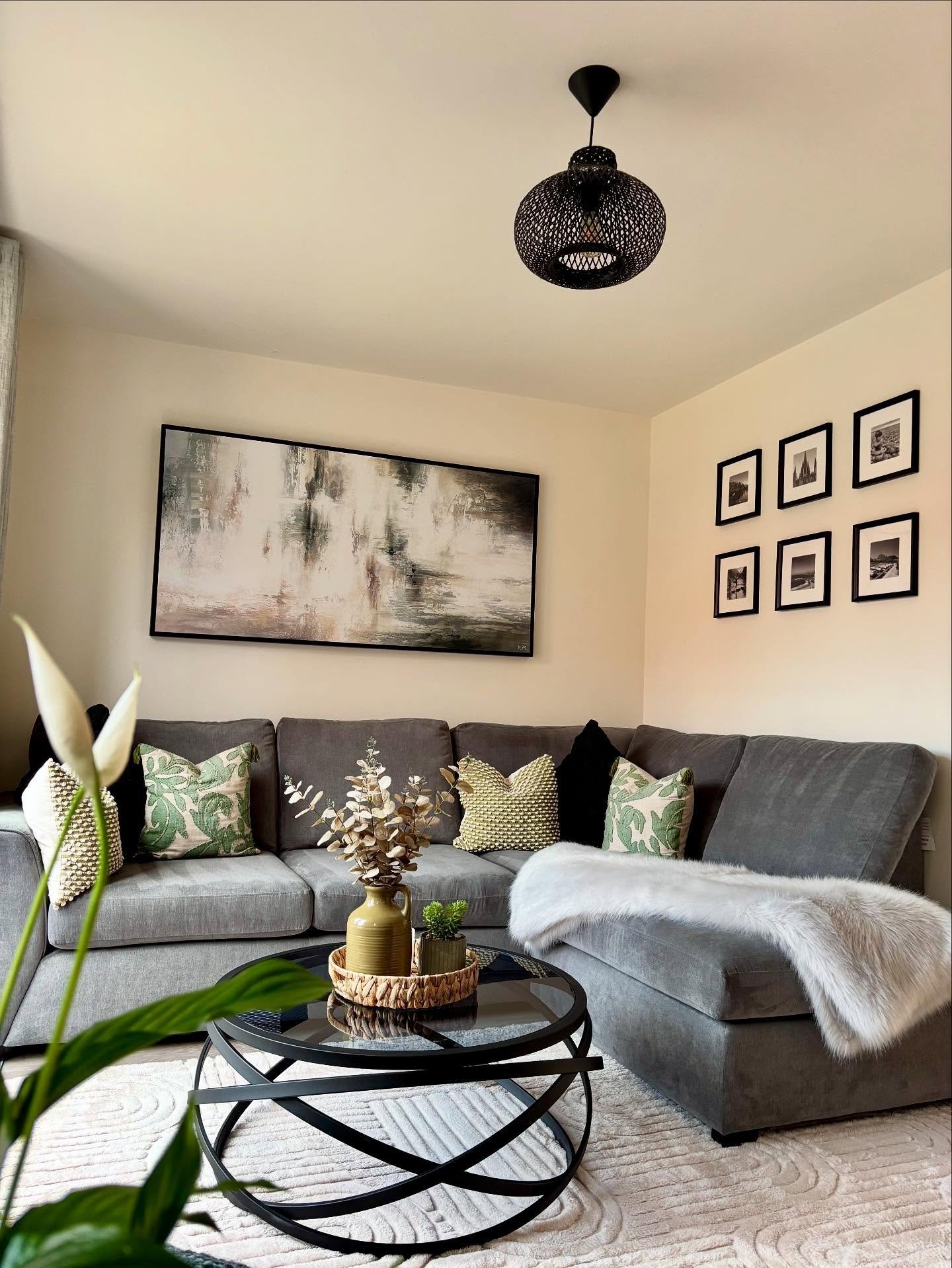
A large, wide abstract painting anchors the main seating area with moody earth tones. Using the adjacent wall for a grid of small frames creates a cohesive wrap-around effect.
Black frames tie the two distinct displays together for visual unity. This layout cleverly utilizes the often-neglected corner space effectively.
The result is a balanced, multi-dimensional view that feels custom designed.
19. Minimalist Ledge Layering
A sleek white shelf creates a subtle display surface for cherished moments. Leaning black frames against the wall offers a relaxed and casual vibe unlike traditional hanging.
Small potted plants introduce a touch of fresh greenery to the monochrome palette. Layering frames of different heights adds depth without visual clutter.
This setup pairs perfectly with the textured pillows on the couch below.
Conclusion
Decorating the wall above your couch helps anchor the furniture in the room. It creates a sense of completion that connects the sofa to the rest of the space.
You do not need to be a pro designer to get this right. Simple changes often have a significant visual impact.
Remember to measure your available space before buying any items. Keeping the width of the art roughly two-thirds the width of the sofa is a helpful rule.
This ensures the arrangement looks balanced rather than cluttered. Take your time to find pieces that genuinely fit your personal style.
We hope these 19 examples provided some useful inspiration for your project. Your living room should feel comfortable and welcoming to you. Pick the idea that suits your home best and give it a try.